There are two ways to get a tone on tone when you are stamping.
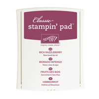
- You can stamp with the same color ink as your paper
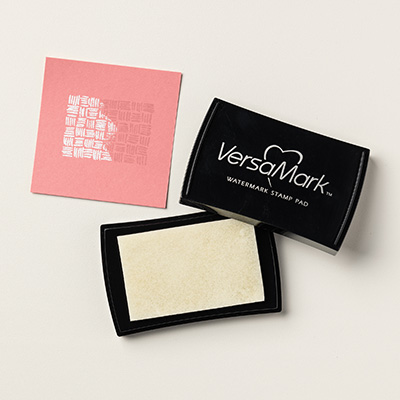
- VersaMark Watermark ink pad
"You’ll achieve a subtle tone-on-tone effect when you stamp with the watermark ink pad. Any design stamped on our colored card stock will appear a few shades darker than the card stock, giving your project depth and interesting backgrounds. When stamped on text-weight, light-colored papers, the image will look like a watermark; the paper actually becomes slightly transparent. It is also perfect for resist stamping and heat embossing."

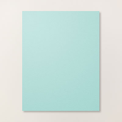
I stamped the butterfly image from Papillon Potpourri stamp set with Versamark Watermark ink on Pool Party and then punched out with the Elegant Butterfly Punch. The smaller butterfly is cutout and embossed with The Big shot using the Beautiful Wings Embosslit. Have any questions about this project or want a complete list of the supplies, happy to help just post a comment or email me.

Here is the completed card which we will be making at my monthly first Thursday Stamp and Shop, still a few spots open.

Don't miss the first in my Techniques, How To Videos Series that start tomorrow right here on my blog! No matter if you are a new to stamping or a pro you will find these inspiring. You will also have the opportunity to download a free tutorial and technique page to make your very technique booklet. Be sure and subscribe to my blog, so you don't miss a Techniques, How To Video Series!
Tomorrow's Sneak Peak…


Leave a Reply